I reviewed AutoCAD fonts against Australian Standard AS 1100.101-1992. Here are the results
I am developing a template in AutoCAD that adheres to the Australian Standards AS 1100.101-1992 Technical Drawing Part 101 General Principles.
In this article, I am focusing on the section concerning LETTERINGS and NUMERALS also known as FONTS.
To evaluate which font to use in my template, I will be doing a comparison of various fonts against the Australian Standards AS 1100.101-1992. I will be creating a font table listing each font's compliance with the Standards. Additionally, in AutoCAD, I will be presenting fonts with the sentence, "The quick brown fox jumped over the lazy dogs," in both upper case and lower case, along with numerals and symbols. This information will be plotted onto an A1 sheet. Both shx and True Type fonts will be included.
The height of the characters are 5mm.
The maximum line thickness of the characters to be 0.1 times the height (h), where h is defined as 5 mm. Hence 0.5mm
The spacing between characters to be twice the thickness of character lines or at least 1mm, whichever is greater.
Word spacing to be between 0.6h and 2h. 3mm and 10mm
Spacing between lines to be 0.6h
The Australian Standard specifies the use of these fonts:
Upright Gothic, Sloping Gothic
ISO 3098/1 Type B Upright, ISO 3098/1 Type B Sloping
Microfont
I didn't include examples of ISOCT fonts as the sentence length was 250mm with a character height of 5mm on A1. I have limited the sentence length to 230mm.

Spreadsheet tracking fonts in comparison to the Australian Standards
ISO 3098/1 Type B characters are not specified as a particular font in the AutoCAD software. It is unclear whether this font style can be sourced and imported into AutoCAD, or if it simply defines the appearance of the chosen font. There are Reddit posts and blogs that do provide links to an "ISO3098B.SHX" file for download; I have not clicked on these links. Regarding ISO 3098 characters, it is presumed that the ISO and ISOCP fonts in AutoCAD reflect the ISO 3098 characters.
The difference between the ISOCP font and the ISOCT font has been noted in a group chat from 1995, which states, "ISOCP is the Proportional font. ISOCT is the tabular or fixed-width font." Thanks to K.C. Jones on groups. google. com, comp. cad. autocad (and no I am not stringing these together). But other than that, I have been unable to find any information that verifies this.
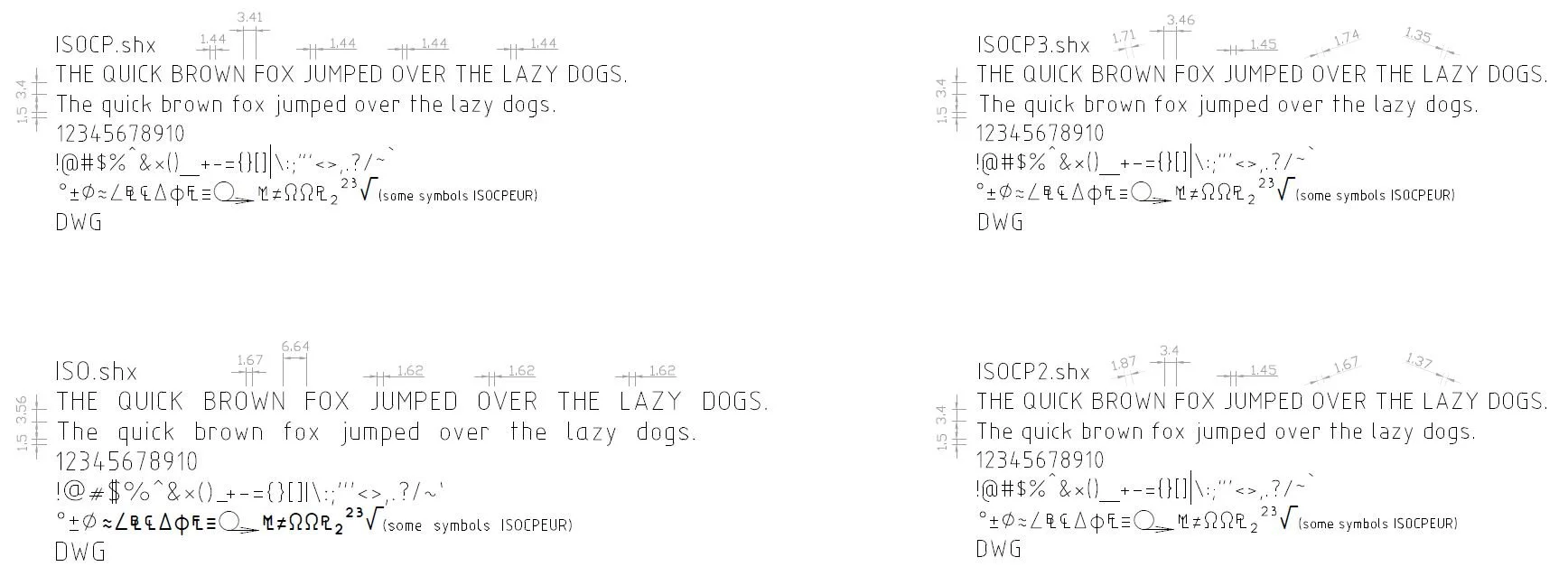
ISOCP shx fonts
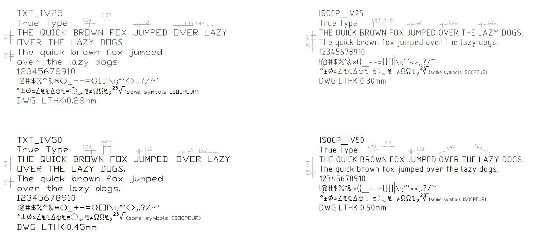
ISOCP with TXT True Type fonts
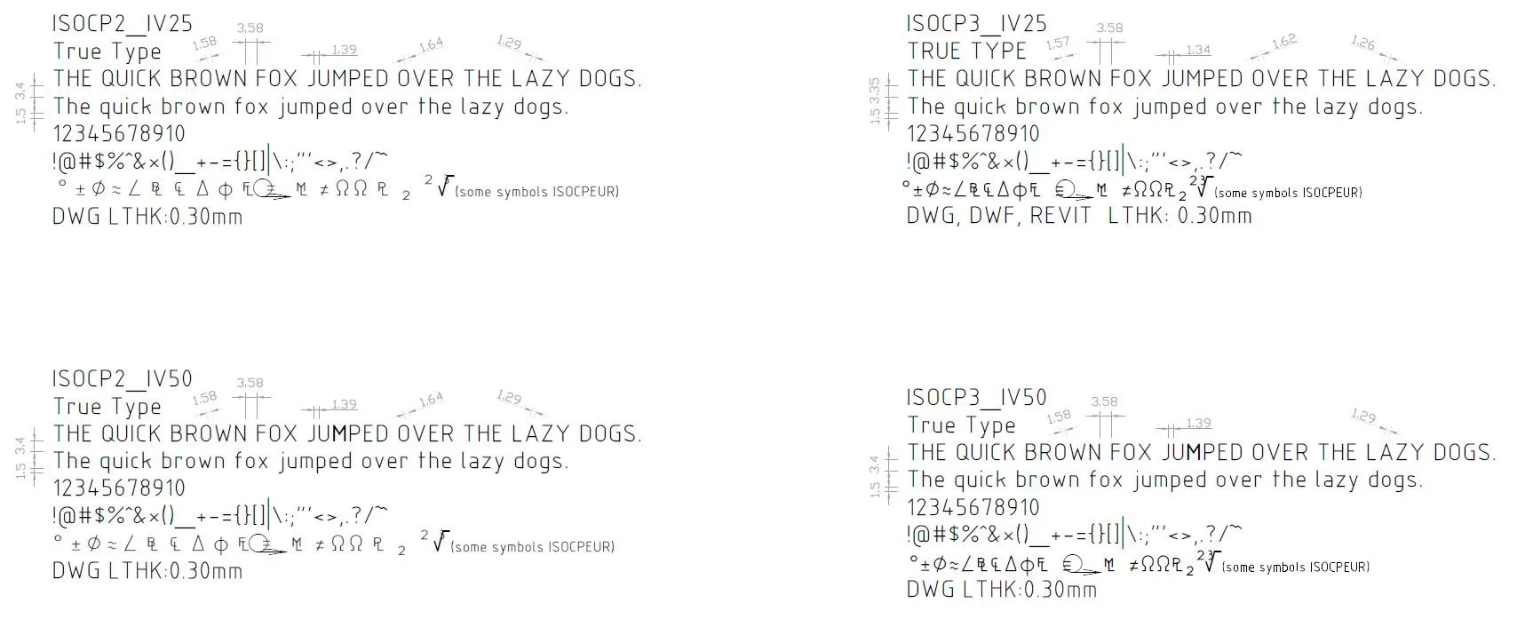
ISOCP True Type fonts
In AutoCAD, I identified the fonts that fit the Gothic criteria. There are several Gothic fonts available, but I opted for MS Gothic fonts and included Century Gothic. Simplex and Roman I also categorized under Gothic. The Microfont type remains a mystery to me.
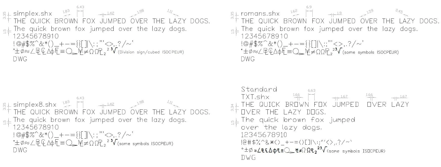
Roman and Simplex shx fonts with a TXT shx font
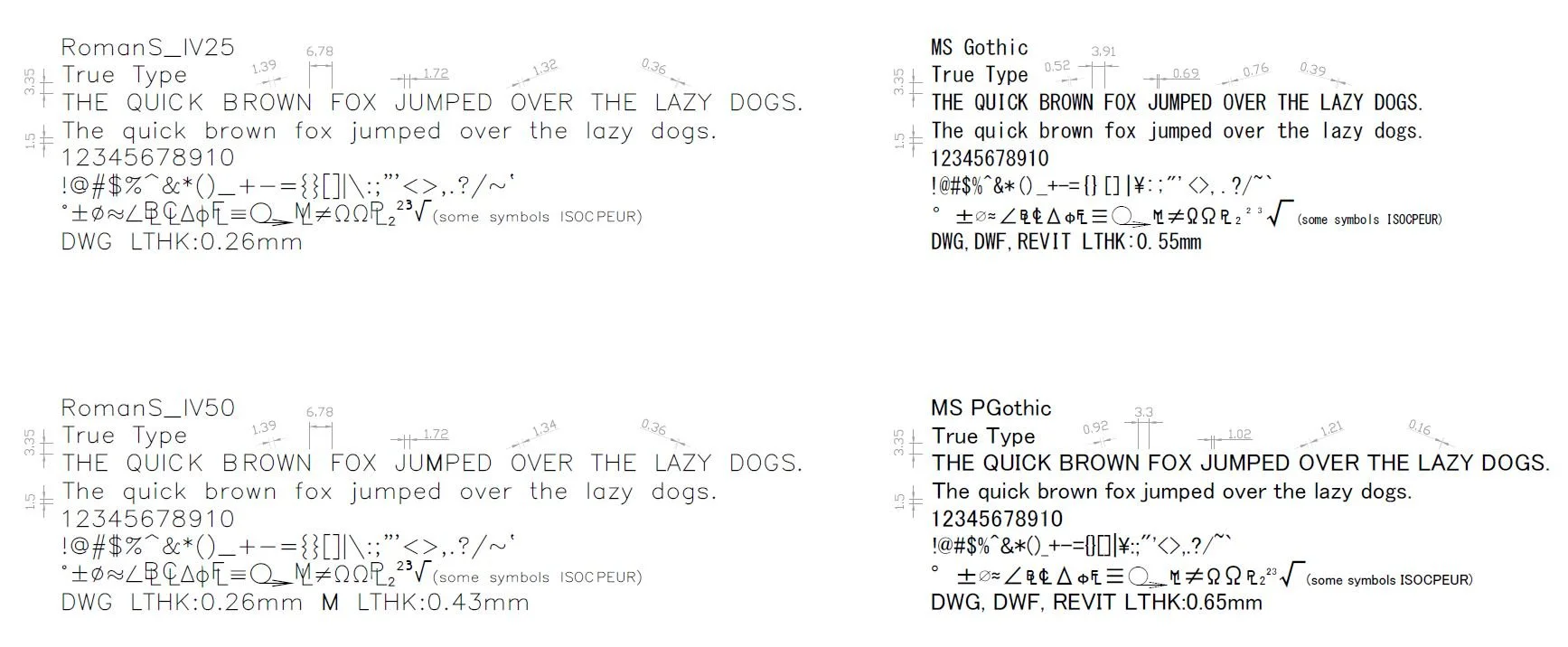
Roman and MS Gothic True Type fonts
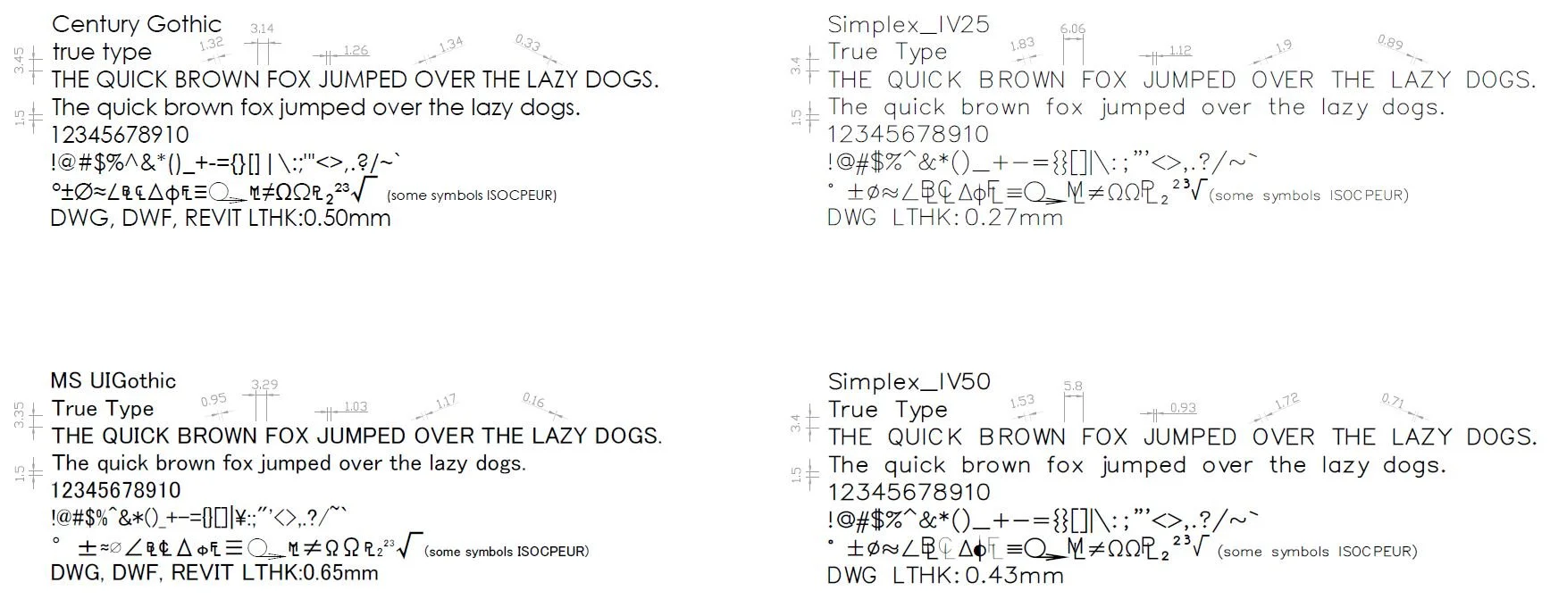
Gothic and Simplex True Type fonts
Other fonts analysed include:
TXT: This appears to be a basic font that is set as the initial standard in the text styles dropdown on the AutoCAD ribbon.
Arial: Previously the default font for all Microsoft Office Software.
Calibri: Replaced Arial as the default font for Microsoft Office in 2007.
Aptos: Introduced in 2024 and replaced Calibri as the default font for Microsoft. However, Aptos was not included in the analysis as it was not available in the AutoCAD fonts selection.

Arial, Calibri and ISOCPEUR True Type fonts
I was unsure about the measurement of the spacing between the letters L and A. Although the characters are in close proximity to each other, considering their appearance, I would adopt a lenient approach in assessing the size between them. The space between the L and the A might not matter much given that they are easily recognizable.
Symbols in fonts that didn't have symbols provided, defaulted to ISOCPEUR.
Certain symbols for ISOCP_IV25, ISOCP_IV50, ISOCP2_IV25, ISOCP2_IV50, ISOCP3_IV25, and ISOCP3_IV50 may not plot correctly, and this issue will not be detected during the preview phase before plotting.
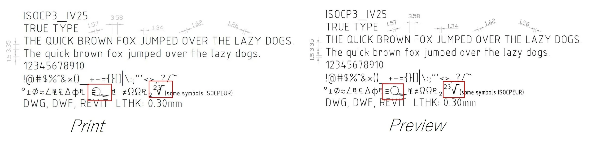
An example of the font when printed and before printing.
I have also outlined the compatibility of fonts from the AutoDESK supported fonts guide. DWG, DWF, and REVIT. This information was obtained from the Autodesk helpdesk. For more details, please refer to the following link: https://help.autodesk.com/view/DOCS/ENU/?guid=Supported_Fonts_Docs
As for my own decision with picking a font, I will go with ISOCPEUR.
What fonts do you use?
Gaye Higgs
Berlin Blue Drafting Services